On Simplicity (and Thomas Heatherwick)
The designer thinks our buildings are too flat, plain, and straight. He's wrong, we need more of what he calls boring.
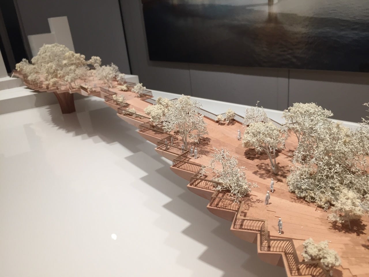
Thomas Heatherwick, the designer of marvels like the dead Garden Bridge in London, the deadly Vessel in in New York, and dead Sidewalk Toronto, has written a book titled Humanise, where he he lists what makes buildings boring, as published in the Guardian:
Many of these are diametrically the opposite of what I have written and taught, most recently in my post OK, what should a green building look like? where I suggested that buildings should flat, plain, and straight, not to mention short and boxy. Everything Heatherwick wants would make them too costly, too complicated, too leaky, too inefficient, with way too much upfront carbon.
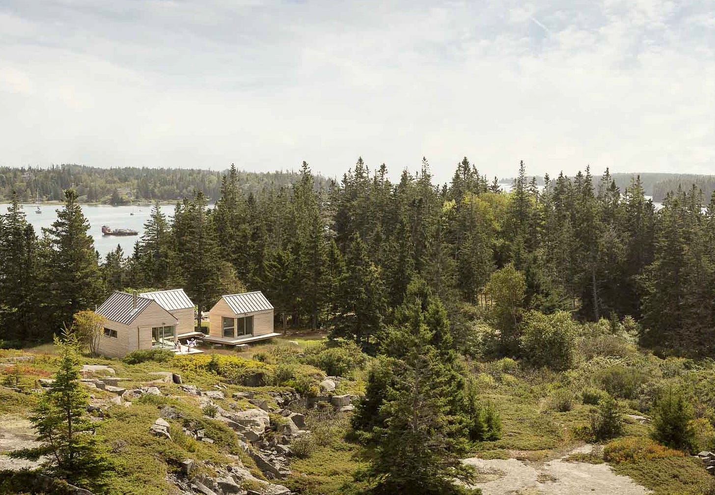
Everything that Heatherwick hates, I have suggested we need more of. Picking up on Bronwyn Barry’s hashtag #BBB “Boxy But Beautiful”, I noted that Buildings Can Be Boxy but Beautiful if You Have a Good Eye and used an image of Opal Architecture’s Little House on the Ferry (seen below) as my poster child for simple forms and elegant proportion. They often prove that you don’t need to pile on bumps and jogs and Heatherwick’s silly ornamentation to make a building beautiful. So do Architype in the UK.
While complaining about Bjarke!, an architect who also often goes over the top and lays it on too thick, I noted, “If we are ever going to get a handle on our CO2, we are going to see a lot more urban buildings without big windows, without bumps and jogs. Perhaps we might even have to reassess our standards of beauty.” We have to get used to flat, plain and straight.
Architect Elrond Burrell once wrote a tongue-in-cheek article titled 10 Things I hate about Passivhaus! where he explained why he embraced flat and straight:
“I used to enjoy the rhythm of rafter ends projecting out around the eaves of a house. I admired timber and steel beams apparently gliding smoothly through external walls or floor to ceiling glazing. No more! I can’t help but see the thermal bridging these details create, the resultant heat loss, material degradation risks and mould risks.”
Thomas Heatherwick is the King of the Thermal Bridge. I see them everywhere in his work, like in these ridiculous windows I saw in New York City that have too many mullions and too many panes on too many angles.
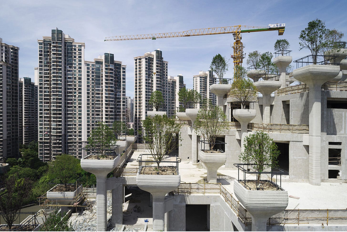
Heatherwick is also the King of Upfront Carbon, pouring massive amounts of concrete to support his silly little trees in China or in New York’s Little Island.
This could turn into a post called 10 Things I Hate About Thomas Heatherwick, starting with his exercise in making everything more complex, leaky, and expensive than it has to be, but I will be positive and instead will offer a bit of my new book, The Story of Upfront Carbon from New Society Publishers. I look at a lot of design tools to reduce upfront emissions and previously posted about ephemerality, but in response to Heatherwick, here is my paean to Simplicity, with added illustrations.
Simplicity
Occam’s razor is a thought exercise attributed to William of Occam, a theologian who died in 1327, and is usually interpreted as “the simplest explanation is usually the right one.” It’s called the razor because it “shaves away” complications. However, what might be the original source of the phrase, from his Summa Logicae in 1323, is perhaps even more relevant; Frustra fit per plura quod potest fieri per pauciora, or, “It is futile to do with more things that which can be done with fewer.” Or, as Mies van der Rohe put it, “less is more.”
I learned the phrase “radical simplicity” from engineer Nick Grant, who described how simple forms and appropriately sized windows make efficient Passivhaus buildings more affordable. He wrote:
Passivhaus advocates are keen to point out that Passivhaus doesn’t need to be a box, but if we are serious about delivering Passivhaus for all, we need to think inside the box and stop apologizing for houses that look like houses.
Simplicity is hard. It is much easier to add stuff and bling than it is to apply the razor and make it as simple as possible. This is true of everything, even writing; the French philosopher Blaise Pascal famously apologized: “I would have written a shorter letter, but I did not have the time.”
It’s true of industrial design—Dieter Rams pulled it off for Braun in the sixties and seventies, noting in the last of his ten design principles:
Good design is as little design as possible. Less, but better—because it concentrates on the essential aspects, and the products are not burdened with non-essentials. Back to purity, back to simplicity.
Do you remember the shock of first seeing an iPhone? Steve Jobs was a fan of Dieter Rams. Blackberry addicts like me agreed with TechCrunch, which published a post titled “We Predict the iPhone Will Bomb” : “That Virtual Keyboard Will Be about as Useful for Tapping Out Emails and Text Messages as a Rotary Phone.” Meanwhile, Apple developed a design aesthetic of simplicity and minimalism that everyone now copies.
Architect Michael Eliason notes the many virtues of buildings that are simply designed. He calls them “dumb boxes.”
“Dumb boxes” are the least expensive, the least carbon intensive, the most resilient, and have some of the lowest operational costs compared to a more varied and intensive massing. … Every time a building has to turn a corner, costs are added. New details are required, more flashing, more materials, more complicated roofing. Each move has a corresponding cost associated with it. … Dumb boxes are great from an energy consumption standpoint because they’re more efficient owing to lower surface area to volume ratio over buildings with more intensive floor plans.
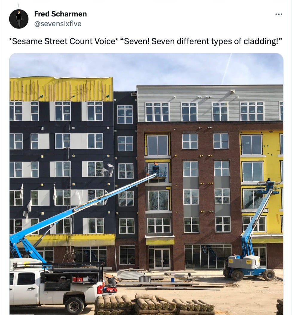
But designers in North America are terrible at it. In buildings, you get “sample-board modern” with twelve different materials applied to jogs and bumps and way too much glazing. They go green by adding expensive batteries and solar panels instead of insulation. In cars and trucks, you get front grills that look like giant chrome cheese-graters and six video screens inside. They go green by loading in batteries that weigh as much as a small car.

For all of the magazines and books about minimalism, people don’t appear to want simplicity. But as Andy Simmonds and Lenny Antonelli wrote, it’s key to reducing impact:
Designing and building as simply as possible—true value engineering or “integrated design.” Asking: can this building be made simpler and more modest? Can the building be smaller or use less materials through innovative engineering approaches?”


well, Heatherwick is like a fashion designer, when what we really need is a good tailor.
One characteristic of the old historic boxy buildings is that had great texture. Stone, hand made brick, lime plaster, and wood clapboards are all very rich materials. Modern materials, in contrast, like vinyl siding, acrylic stucco, cement based clapboards, are all pretty dull and lifeless. This obviously presents a big challenge for the designer who is striving to build a lovable modern boxy building.