In praise of ugly old buildings
A discussion of what some call an ugly pile brings back memories of an ugly duckling I designed.
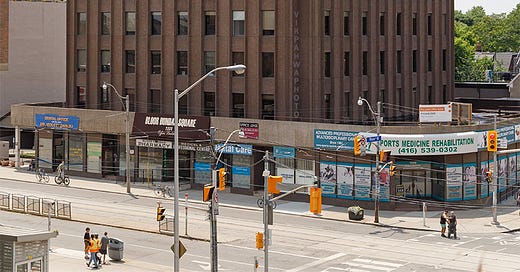
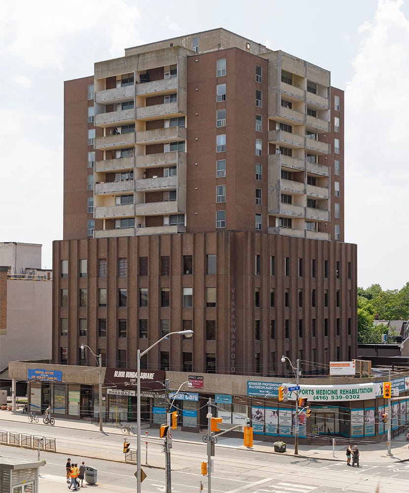
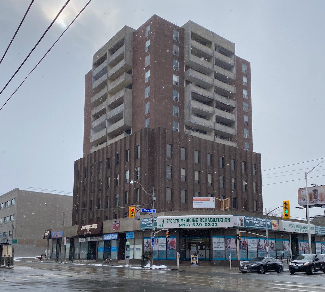
Whenever I am at the corner of Bloor and Dundas in Toronto, I smile at the building with the straightforward name “Bloor Dundas Square.” Many consider it to be one of the ugliest buildings in Toronto; when architectural photographer Vik Pahwa published it on his blog and subsequently on Linkedin, he noted that “this image evoked the highest number of responses ever showing that it is part of everyone's psychogeography. What do you think?” I immediately responded,
“I love it. It is as if someone went to the architect and said, "give me a 70s strip mall and a 70s office building and a 70s apartment and just pile them on top of each other." Each piece is an absolutely archetypical icon of the period.”
Others thought I was nuts and asked, “Do you have eyes?” I responded by calling it “the most honest building in Toronto.” Many people had something to say; Architectural critic Alex Bozikovic likes it- “Meets the street with retail that is actually well configured. Good urban design.” Alex Josephson of Partisans was aghast- “Surely you’re being sarcastic.” Kelly Alvarez Doran called it “An Exquisite Corpse of 70's Toronto typologies.” James Turner had the best description: “I love it too! It's like a nostalgia Turducken for me.”
It was built when the city had CR zoning: you could build a given square footage of commercial and residential or a combination of both. These mixed-use buildings were not easy to design or build; offices and residences have different window types and often different grid dimensions.
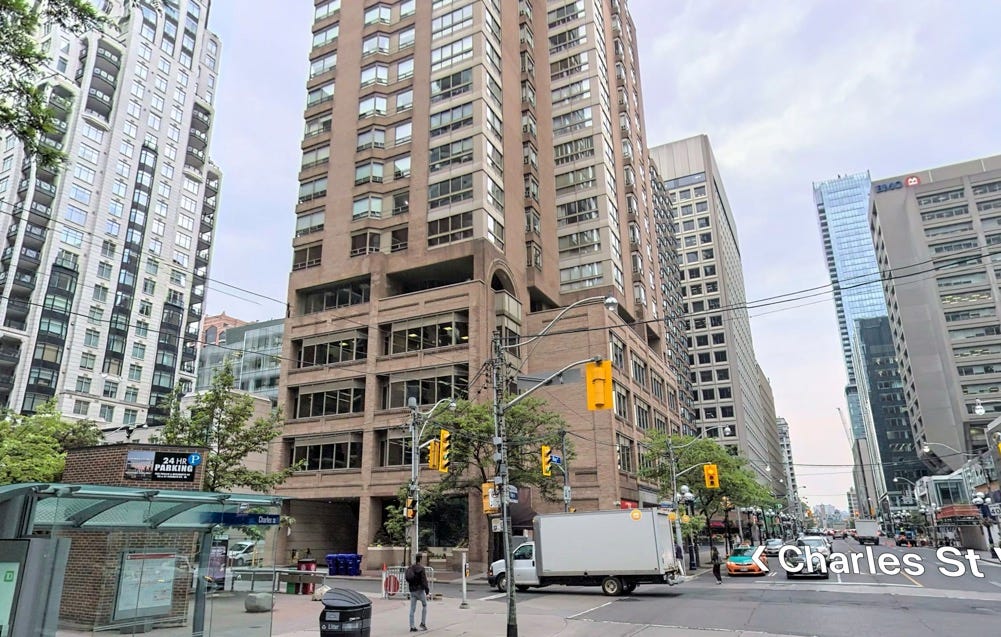
An example where the architect tried hard to make it all work together is at Charles and Yonge; using the same brick, they try to get some visual connection and continuity between retail, office and residential.
My hero, the architect of Bloor Dundas Square, was having none of this and took a different approach to the problem. He or she probably had read Robert Venturi, Denise Scott Brown, and Steven Izenour’s 1972 book “Learning from Las Vegas" which differentiated between “duck” buildings and “decorated sheds.” This architect got all the ducks in a row.
Ducks are buildings that tell you what they are, a “symbolism of function.” So when a duck farmer in Long Island wanted a shop to sell his ducks and duck eggs from, he built it in the shape of a duck. Brock Danner writes, “The Big Duck building was not sculptural, nor abstract, nor referent to architecture itself. It was directly a duck representing a duck.”
Bloor Dundas Square is a Turducken building of retail on the ground meeting the street, with 70s-style offices and 70s-style residential with absolutely no concessions to making them anything else, each a symbol of function, with no compromises in what was the optimal form and style for each type. This is by an architect after my own heart because I used to think that way.

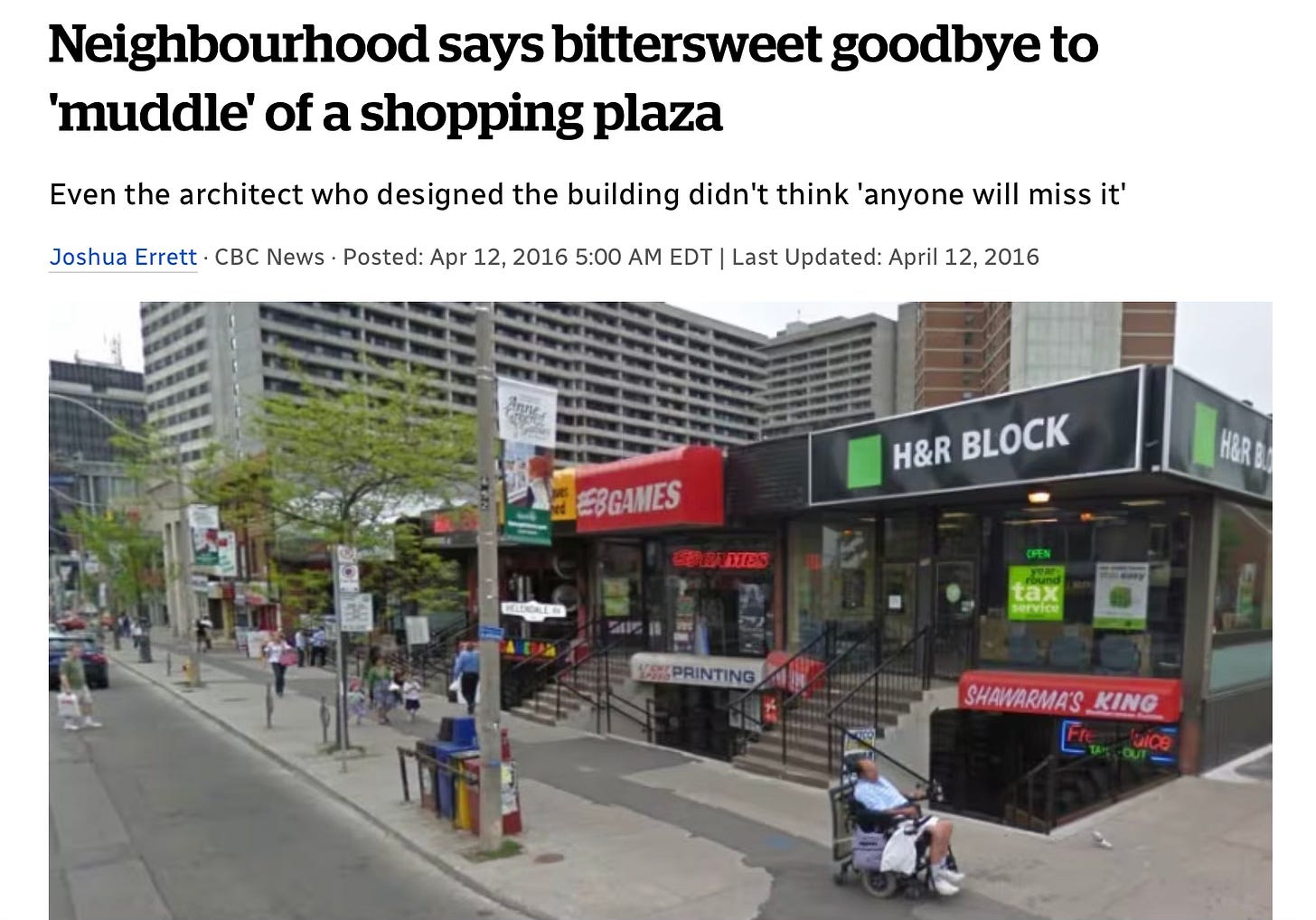
Forgive me for writing two posts in a row about my blessedly short architectural career, but I was the architect of an ugly building, a two-level strip mall at Yonge and Eglinton, that shared some attributes with Bloor Dundas Square. I wrote about it in 2016 when it was demolished:
Back in the 80s, a lot of developers wanted to do two level retail, usually a typology where neither level gets much visibility at all; in fact most were awful. Fortunately it has been killed off by universal accessibility requirements, but at the time it was a big deal. This building was a study in how you could do it and make it actually work; every stair run was calculated, every angle of the glass was designed to bring it as close to the sidewalk as possible while maintaining open stairs to the lower level.
The problems arise when you care more about the mathematics and sight lines than the aesthetics – it was not what you would call beautiful. In the study that was done for the city as required for rezoning, ERA architects noted that “2369 Yonge Street does not exhibit any unique design or physical value and is not representative of a particular design style. Nor does it have any significant historical or associative value.” [And I say such nice things about ERA’s work!]
In fact, many people thought it had value. “Perfectly good retail strip plaza, that used to be filled with the types of businesses that a liveable neighbourhood needs, obliterated to build yet another condo that's completely unsuitable for where it's going to be built.” and “The sad thing is that the new buildings will never support they same level of small-shop retail density. Your design had so many narrow storefronts!“
The CBC interviewed me for an article titled Neighbourhood says bittersweet goodbye to 'muddle' of a shopping plaza. I stole the title of this post from Edward Keenan, who wrote In praise of ugly old buildings. He asks, “does the city need ugly buildings?”
It’s a question raised recently by the imminent demolition of a strip of stores near Yonge and Eglinton that virtually everyone, it seems, agreed were a blight on the neighbourhood. As Joshua Errett, of CBC News, reported this week, even the architect who designed the wheelchair-inaccessible, above-and-below-ground plaza in the 1980s, Lloyd Alter, has long thought it was horrendously ugly. It’s a sentiment Alter told me local residents shared with him almost immediately upon its construction. So when it was announced that it would be demolished to make way for a condo tower, everyone was ready to celebrate.
Except the family-run businesses that leased space in it, like the Korean Cowboy restaurant and the Hollywood Diamond jewellery shop, whose owners and families have commented that they are sad to be forced out. And except for those who have long visited the two video-gaming shops that had been in that plaza. And except those residents of a neighbourhood recently overwhelmed by the Firkin & Starbucks main-street redevelopment routine who now wonder: Where in their area are these kinds of tiny, independent enterprises likely to fit in?
Or, as I told the CBC,
"After saying I'm not sorry to see it go, I can see that buildings like this have a real role to play in the city," said Alter. He recalled the quote by iconic urbanist Jane Jacobs, who said: "Old ideas can sometimes use new buildings. New ideas must use old buildings."
Although he can't overlook the unattractive awnings and disparate shop signs, Alter said he realized what would be missing once the building is demolished. He half-jokingly said small shop owners would one day be forced to look to Hamilton for retail space.
"You're not going to open up a record shop, tattoo parlour or video game store in one of these big fancy condos," Alter said.
Yes, it was an ugly duckling, and many apparently consider Bloor Dundas Square to be ugly. But, even more so than my little project, it has rationality. It works. It makes me smile. Not many buildings do these days.



It is utilitarian, and so it succeeds. Could it be made to look more attractive? Certainly. Better to be utilitarian and bland than convoluted and flashy.
And across the street there's nothing but a vacant sales centre for a long-defunct condo project (Giraffe). A waste of space and resources, while the "ugly pile" keeps on doing its thing of three functions in one.
I have passed by that building hundreds of times and never really taken it in in its entirety. Thank you for drawing my attention to my lack of attention!