How to make buildings boxy but beautiful
Bike tours of Innsbruck and Heidelberg turn up some interesting solutions for dealing with windows.
In a comment to a Green Building Advisor post on windows, Michael Maines noted, “Although small windows are better than large windows for many reasons, it's difficult to design an attractive house with small windows. It's possible but it requires a lot of talent and some luck. An easy way to make most buildings look better is to throw more glass onto them.”
But if you are building to the tough Passivhaus standard, you can’t just throw more glass at it because even the best window doesn’t perform as well as a bad wall, they are expensive, and the numbers on energy and money have to both work. You also can’t throw a lot of bumps and jogs to create visual interest because they increase surface area and add thermal bridges.
It is hard to make a building meet the standard set by Bronwyn Barry’s famous hashtag #BBB- “Boxy But Beautiful.” I have often suggested that architects should look to Europe, and that with “Simple, modern forms, not too many windows but a careful eye to their placement and proportion, and you can have really nice housing to really high standards of energy efficiency, at reasonable costs.”
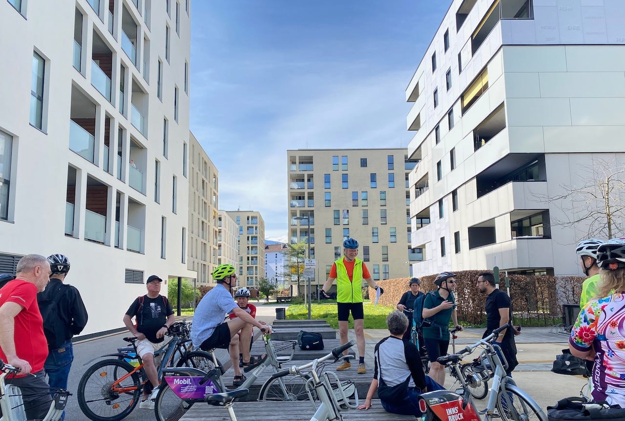
In a world of energy efficiency and low carbon, buildings want to be simple, boxy, not too tall, and with windows that are smaller than we are used to. While doing a bike tour of 42 multifamily Passivhaus projects in Innsbruck and another tour in Heidelberg, I looked carefully at how architects are handling this new paradigm. Here are some of the good, the bad, and the ugly.
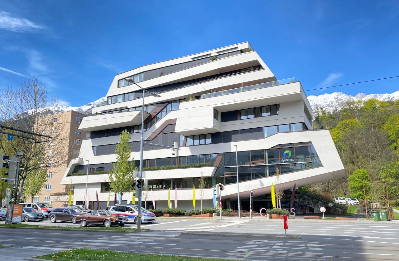
Let’s start with the truly ugly, the Dynatrace building in Innsbruck, an object lesson in what architects should not do. Definitely not Passivhaus; every jog and bump means more surface area, more concrete, and more heat loss. Cantilevers should be avoided because they require a huge amount of concrete and steel. South-facing windows should be limited in area and have exterior shading. Building forms should be simple.
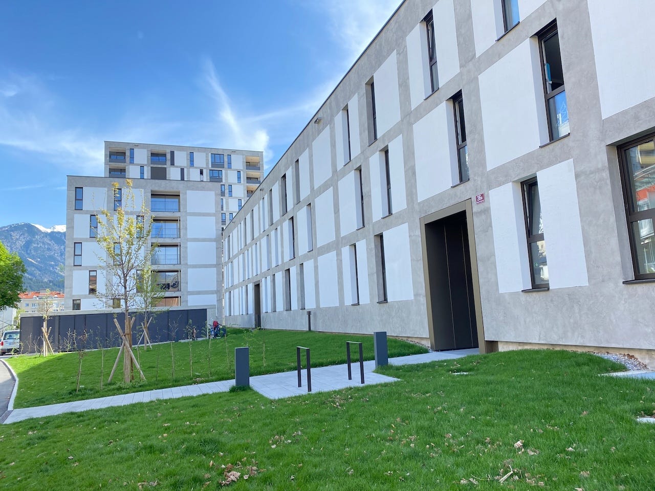
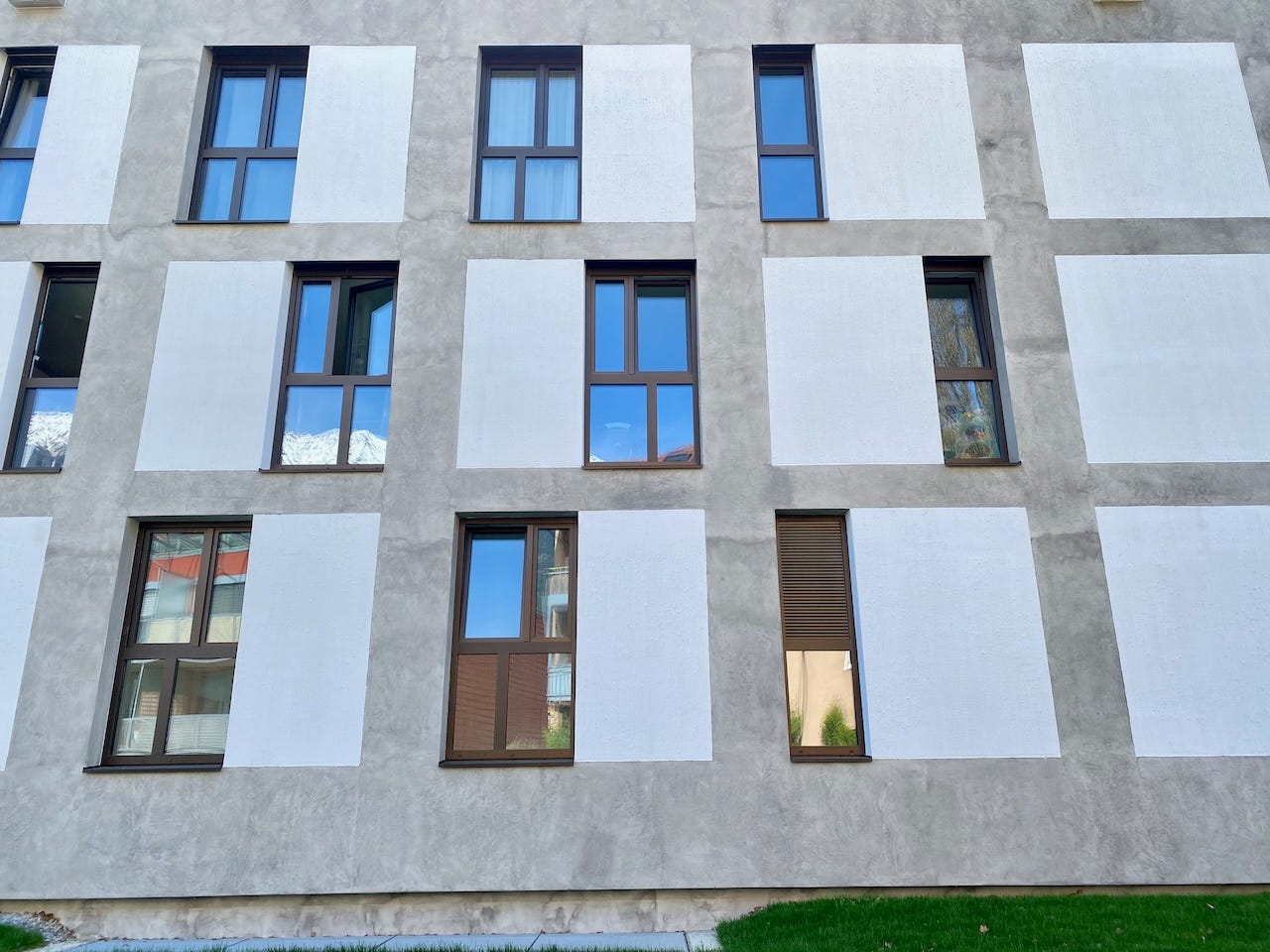
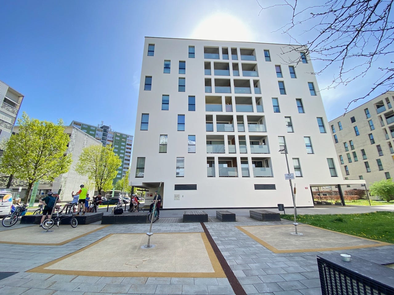
The first project we visited on the Innsbruck tour demonstrated the problems architects have to deal with. Here, we have a simple form and limited window area, and the architects (I did not write down all the names and will update when I get the information) created a grid of a different material and moved the narrow and tall windows around in the gridded space.
They have also broken up the window into smaller panes, which increases cost and heat loss, and I am not certain it was necessary.
When I first saw this done earlier in Bahnstadt, Heidelberg, with flat plaster panels framed in brick, I didn’t like it at all. I thought it looked like the architects really wanted to fill it all with glass but couldn’t. I don’t know why I like it better in Innsbruck.
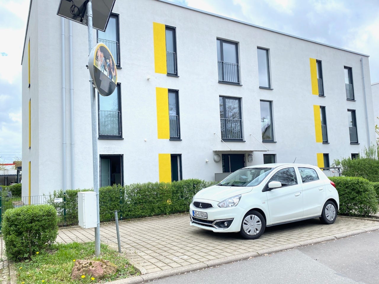
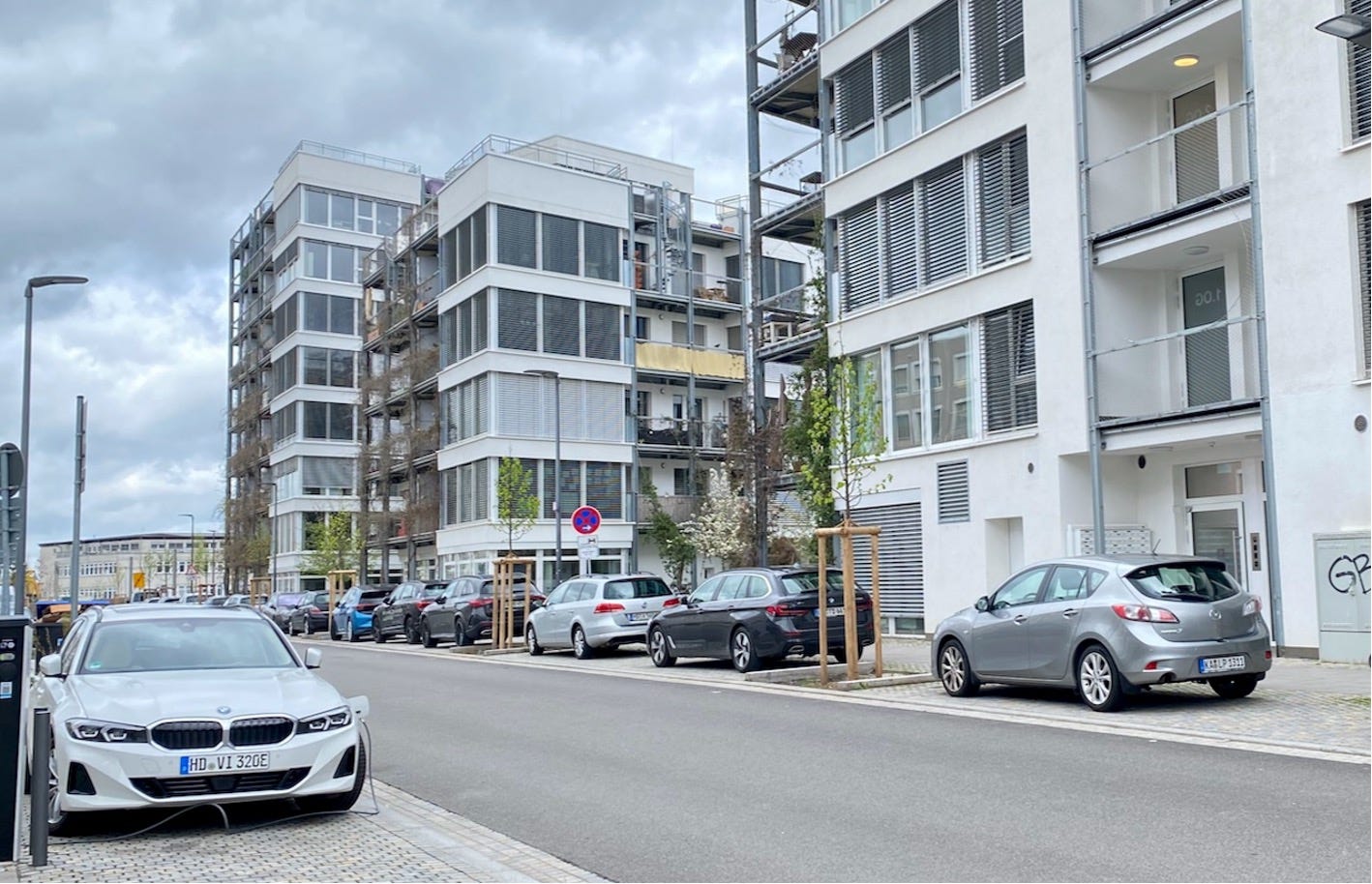
Sometimes, it seems that the architect is at a complete loss of what to do, as in this example in Heidelberg, where a rectangle of yellow paint is added to fill out the window in the wall.
A bit of paint may work on a drawing where a line is a line, but it doesn’t work in the real world.
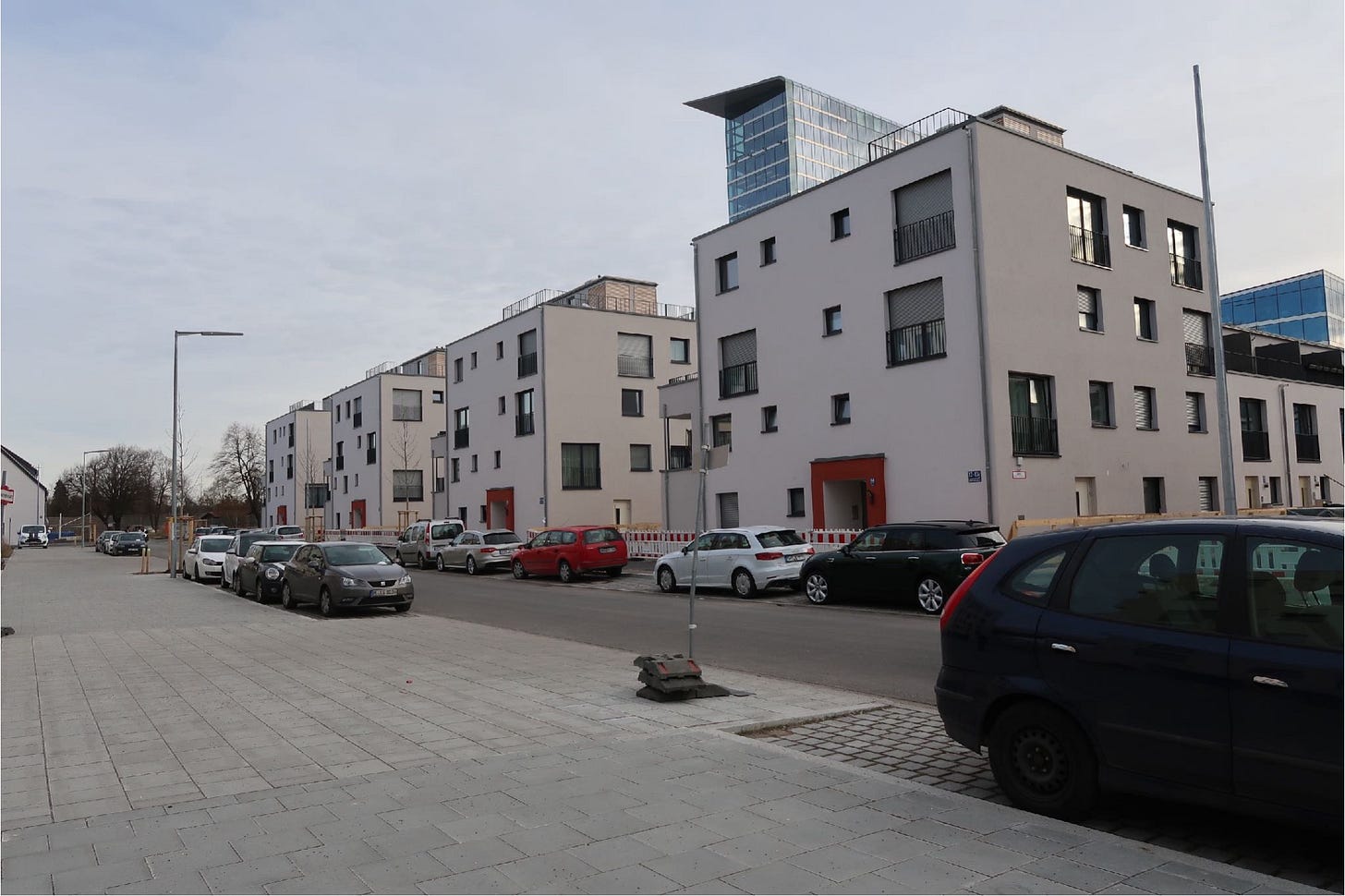
It is a difficult problem. I saw one solution for the first time in Munich a few years ago. I loved the way it looked, with its simple forms, different window sizes, and almost random placements. As I saw more of it, I called it the “Randomizer style.”
Perhaps we should call it “Loosian” after Adolf Loos, who wrote, "The evolution of culture marches with the elimination of ornament from useful objects."
It was done often in Heidelberg, often badly and in excess. It is harder in Passivhaus.
Randomizer style is rampant in Innsbruck. The poor architects don’t have much to work with in Passivhaus; the building is a simple box, and the balconies are all inset to provide shading. However, I thought they did a marvellous job with the windows.
Everybody is doing it. Everything looks good with mountains in the background, but the random window thing helps, although it might be getting a bit overused.
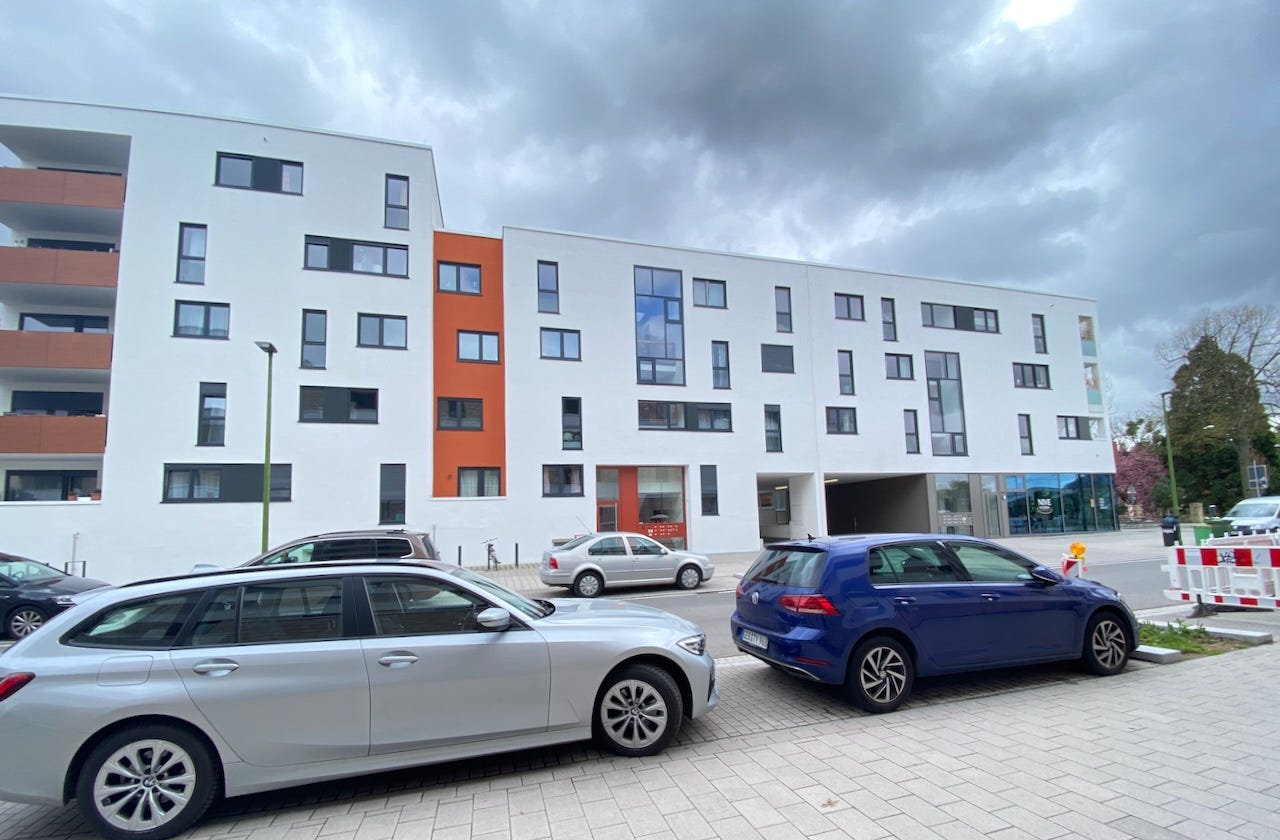
But what are the alternatives? Here, the architects take a North American approach and use six different materials to break up the massing.
I have often complained about North American designs using what I and others have called “sample room modern,” where architects throw everything they have in the closet at the building. Architect and writer Steve Mouzon calls it “ransom note architecture.”
Frank Lloyd Wright said, “A doctor can bury his mistakes, but an architect can only advise his clients to plant vines.” Perhaps we will see more of this in the future.
Or perhaps we should only build where we have gorgeous mountains and deep blue skies in the background.
The late great architect and writer Lance Hosey wrote in his book The Shape of Green that you can't have sustainability without beauty:
“Long term value is impossible without sensory appeal, because if design doesn't inspire, it is destined to be discarded. 'In the end,' writes Senegalese poet Baba Dioum, 'we conserve only what we love.' We don't love something because it is non-toxic and biodegradable, we love it because it moves the head and heart. When we treasure something, we're less prone to kill it, so desire fuels preservation. Love it or lose it. In this sense, the old mantra could be replaced by a new one: If it's not beautiful, it's not sustainable. Aesthetic attraction is not a superficial concern, it's an environmental imperative. Beauty could save the planet.”
Unfortunately, it’s really hard when you have such a limited palette to work with, and many architects fail miserably. In his comment, Michael Maines concluded: “I'd like to see a style popularized that uses low-carbon building materials and careful use of glazing, but that doesn't look like a bunker.” I am not sure we have found that yet.








>>”Or perhaps we should only build where we have gorgeous mountains and deep blue skies in the background.”
That’s probably why Innsbruck was inspiring you.
Open question, Lloyd—what do you think of the Russian khrushchevka-style apartment buildings? I have often thought that part of the Russian dourness is because of the awful architectural design of their housing—and my personal opinion is that Passivhaus design quite closely emulates the same architectural style. It’s not aesthetically appealing.
Can you say more about the inherent energy inefficiency of windows? I live in a 1920 brick courtyard building in Chicago, in a fairly large fourth floor condo with many large windows and lots of light. The building lacks central air, but we’ve found that it seems to have been designed so that by strategically opening and closing windows in the summer, we are able to achieve cross breeze that keep the space comfortable on all but the very hottest days without AC. Is this benefit offset by whatever heat is lost through the windows in the winter?