Why can't we just use one standard set of symbols for washrooms?
It's embarrassing when you can't identify the men's room.
There will probably not be a post on Monday as I will be returning from a weekend in Detroit. Regular programming will resume on Wednesday.
Kelly and I met a friend for lunch recently at the wonderful Bar Raval in Toronto (I wrote about its design on Treehugger but the food is great too) but Kelly was embarrassed when she walked into the wrong washroom. Instead of there being the usual male or female image for identification, the graphic showed images of the fixtures; the men’s washroom had a toilet and a urinal, while the women’s had a toilet only. I should have taken a photo, because I have been collecting unusual images of bathroom graphics for a while.
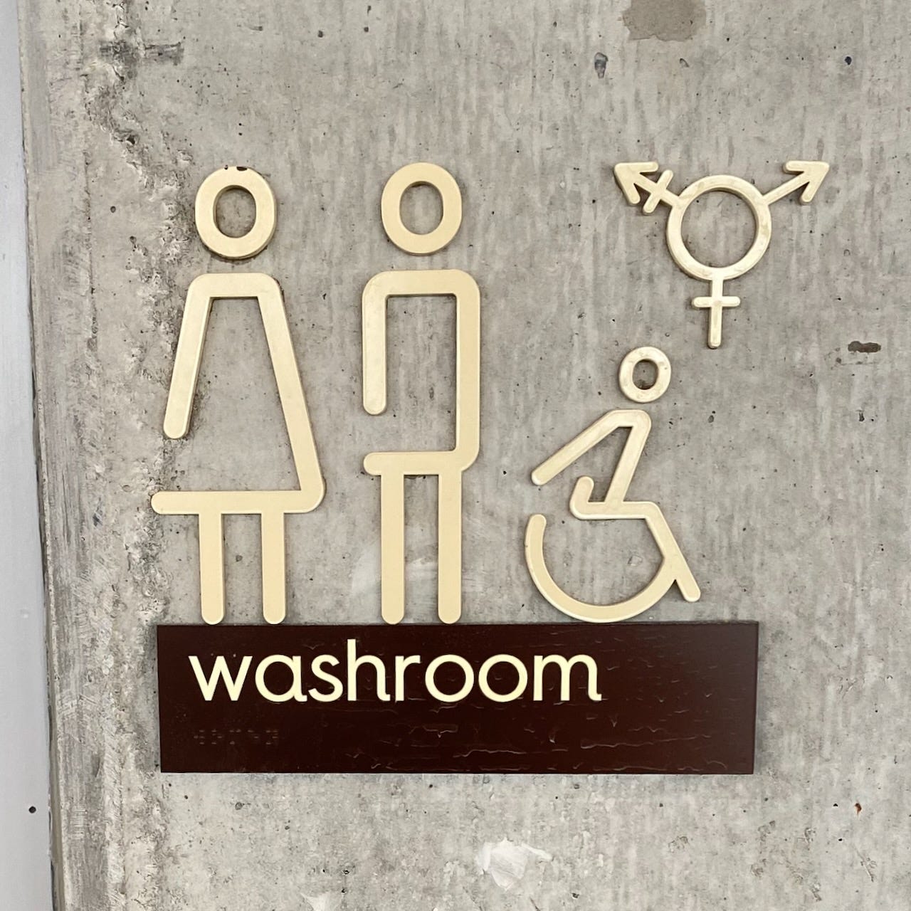
Most of the odd ones I have seen were in Europe, but the one shown above here was for a new office building in Toronto which I toured last week.
I asked the architects about this; I thought there was a standard in North America, and wondered how they got such a weird one, where the difference between the two symbols is the angles of the side; it all seemed a bit subtle. The architects explained that they didn’t do the signage package so couldn’t say much.
I first noticed weird washroom signs when I was in Portugal a few years back, where every single one was different. Here, the woman is in pants but has a slender waist and different hair. That’s prety subtle.
I thought this one was telling me where to charge my phone, looking more like an electrical plug than a women’s washroom symbol.
The equivalent men’s symbol.
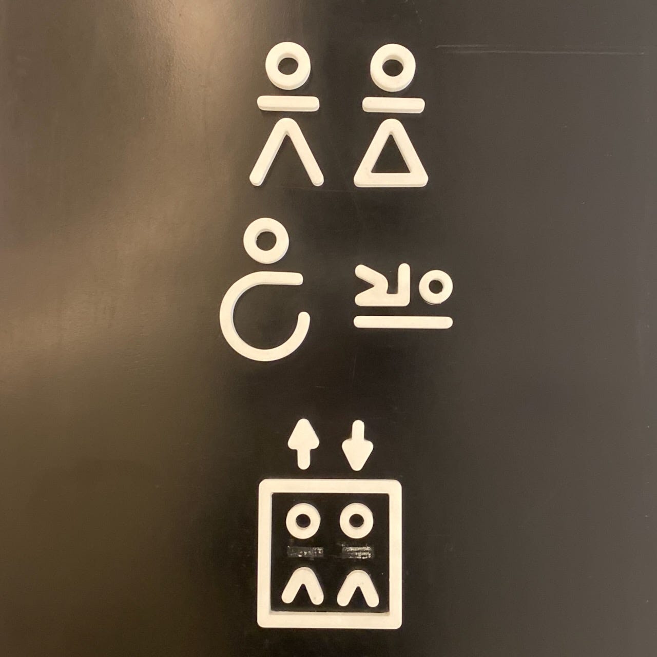
I thought these were signs written in Inuktitut script, but no, they are bathroom signs in the The Museum of Art, Architecture and Technology in Lisbon.
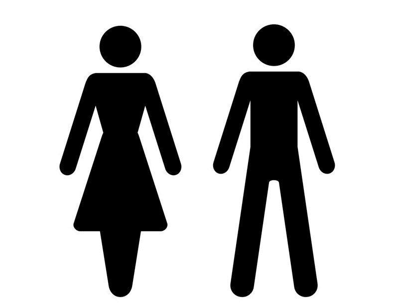
There actually is a recommended standard, ISO 7001, which are “the result of extensive testing in several countries and different cultures and have met the criteria for comprehensibility set up by the ISO.” Like so many bathroom symbols, the woman is in a dress-like thing. I do not know why she doesn’t have two legs.
Things get messed up with the trend to all-gender washrooms with the person on the right not quite sure about what to wear.
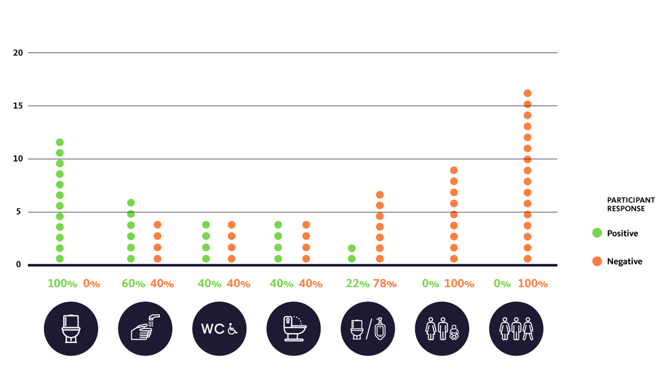
A few years ago the design firm Gensler designed washroom signs for San Francisco Airport, which had both all-gender and conventional washrooms. They found that most people preferred the image of the fixture and hated the three people. And it turns out that Bar Raval nailed the current thinking: Show the fixtures, not the people.
“As a result of these findings, we developed a simple graphic representation of a toilet paired with the text identifier “Restroom.” In the spirit of equality that emerged from the focus groups, we revised the traditional gendered restroom symbol by pairing the toilet symbol with the historical men and women symbols — in effect identifying the gendered restrooms as the ones with certain identification requirements, instead of the all-gender restroom.”
Many designers are avoiding the issue altogether by going with single-stall designs, but they are more expensive and sloppy men can ruin the experience for women. The signage has to evolve to cover both multi and single stall designs, and I suspect this is the future of signage: fixtures without people, and a lot more confusion until users figure it out.
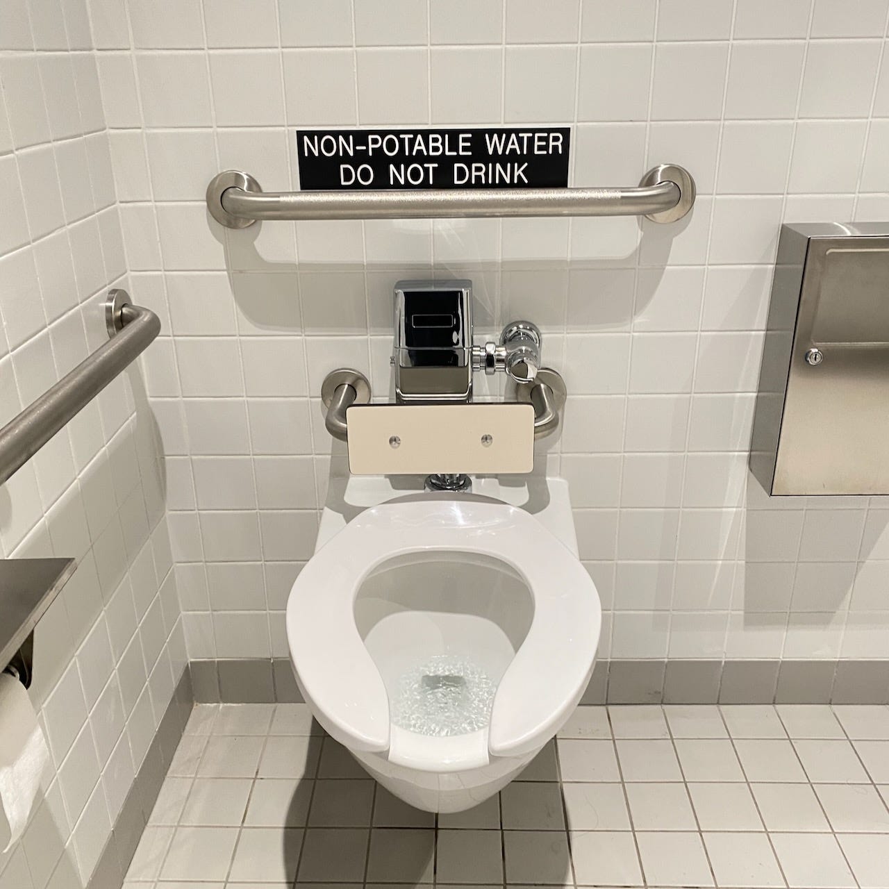
And finally, my favourite bathroom signage in Toronto, in the same building as the top image. How did I get to my age without knowing that this was a problem!
This is a post about graphic design. I know that in some circles and states the question of bathroom use has been politicized, so I am turning off the comments on this one.

