Based on Le Corbusier’s Manual of the Dwelling, this is a series where we develop a manual for understanding the homes we have today and what they must become – resilient in the face of change, supportive of our health and well-being. Efficient but, more importantly, sufficient – just what we need to be happy, healthy, and comfortable.
I have been writing about bathrooms for years, most recently about bidet toilet seats. So much is written about bathroom design, but almost nothing about a bathroom’s comfort, safety, or functionality. Or we talk about the entire room and never get into the details of a specific fixture, like the bathroom sink.
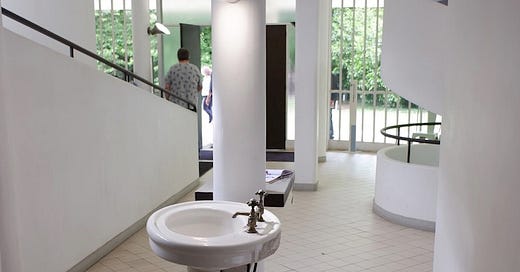
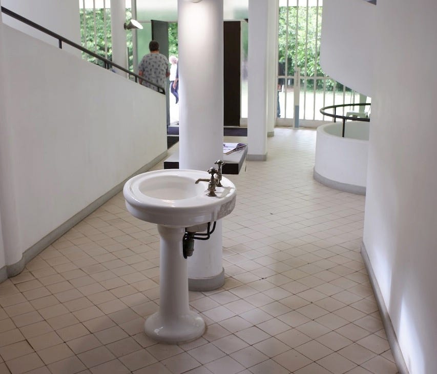
My wife Kelly and I hate our bathroom sink. Not its location in the hall between our sleeping area and the shower; I have done that in every house I lived in, not in homage to Le Corbusier, who famously did it in the entry of the Villa Savoye, but because it is practical, it can be used when someone is on the toilet or in the shower. I used to move an old china pedestal sink, much like Le Corbusier’s, from house to house.
This sink is terrible because of its shape and size. I didn’t think it would be a problem because nobody in North America actually fills a sink; they wash in the stream of water from the faucet. Alexander Kira noted in his 1966 book, The Bathroom, that this is the only effective wash method.
Proper rinsing (and cleansing) can be achieved only by using clean running water rather than a pool of water unless, of course, it is changed several times during the process. Since, in fact, the overwhelming majority of people today (94%) regularly wash their hands under a stream, this is not as much of an issue as it was in the past when the habits established during the era of the hand-filled washbasin still prevailed.

Yet, as Kira notes, the basic design of our bathroom sink is based on those hand-filled basins of 150 years ago; they just added faucets.
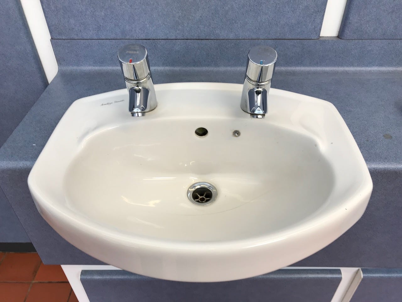
94% of Americans may wash their hands in the stream, but many still have separate taps. I was dismayed by the brand-new washrooms at the Royal Botanic Garden in Edinburgh- two taps and no stopper. How the hell do you wash your hands in this? If there was a stopper in a public washroom, would you use it? I got complaints from Caledonia when I asked, Why do the Scots have such terrible bathrooms? But this is seriously non-functional. (read more about this at the cleverly named bathroom site, The Privy Counsel.)
But even when the hot and cold are combined, modern sinks are problematic. Kira continues:
Most conventional lavatories (the American term for bathroom sink) are unfunctional since they are still nothing more than the old-fashioned wash basin fitted up with a water supply and drain and take no cognizance of the fact that when water was supplied, it changed our habits totally. Almost without exception, the water source is obviously intended solely for filling the basin… The result is that it is virtually impossible to get one’s hands under the stream and that one is forced to assume a tiring and uncomfortable posture because of the low heights at which lavatories have been traditionally mounted.
Having read Kira, I made the vanity higher and placed the faucet a foot above the sink so that there was lots of room. But I picked a small squarish bowl because I knew its function had changed to where it functions simply as a drain. I forgot about the later chapter where Kira writes, “toothpaste and spittle have a tendency to adhere tenaciously to a dry surface and require deliberate cleaning or a continuously washed surface, such as might be provided by some form of self-rinsing lavatory.” Our sink has corners and crannies that are hard to keep clean, and it is so small that the counter is covered in water and tenacious toothpaste.
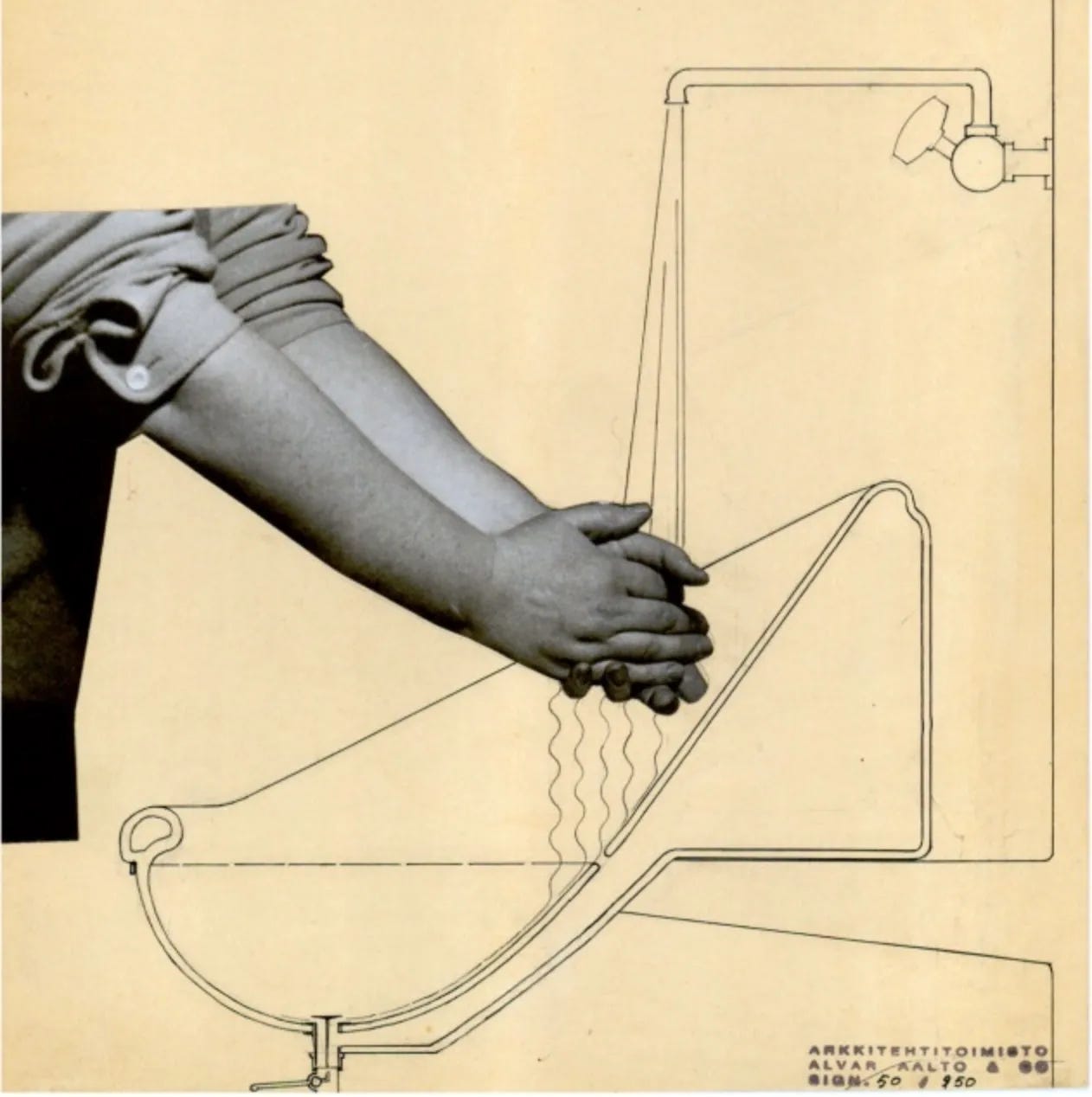
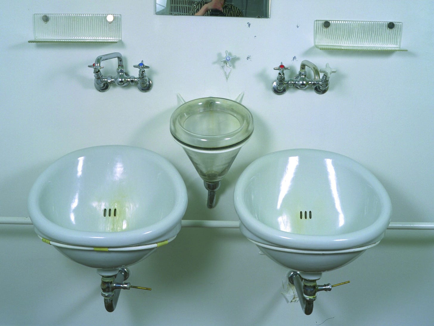
Kira was by no means the first person to think of a self-rinsing sink. Around 1928, Alvar Aalto designed the sinks for the Paimio Sanatorium with a sloping back to minimize splashing, self-clean, and be silent. Please also note how high the faucet is to make it easy to get your hands under it. Rain Noe of Core77 quotes Aalto:
"…Incredibly small details can be used to alleviate people's suffering—[For example, the] washbasin. I strove to design a basin in which the water does not make a noise. The water falls on the porcelain sink at a sharp angle, making no sound to disturb the neighboring patient, as in the physically or mentally weakened condition, the impact of the environment is heightened."
I have never understood the point of double sinks in a bathroom, but Aalto made a case for it, along with a separate sink for spitting. According to the Paimo Sanitorium website, “The wash basin designed by Aalto was of a special type, and its structure made it possible to be used with as little noise as possible. In Paimio Sanatorium, every patient had their own wash basin, which at that time was a hygienic solution, even a luxury.”
I also liked the idea of a separate place to spit; I have often thought bathrooms should have a separate sink for brushing teeth so that we are not spitting into the sink that others will be using. But given that nobody is using the sink as a washbasin and are instead treating it as a drain, the dental sink is superfluous.
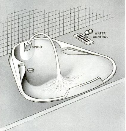
Kira designed a sink where the water came out of a spout and arced over to fall on a bump in the sink so it would be self-cleaning.
My doctor has a brand new office with what’s called an ICS or Infection Control Sink, which doesn’t splash and is self-cleaning.
“This sleek, modern and compact design received a Green Good Design 2013 Award from the Chicago Athenaeum: Museum of Architecture and Design and The European Centre for Architecture Art Design and Urban Studies and goes well with modern décor. You'll find American Standard Commercial Sinks wherever durability, dependability and beauty are on call. In hospitals, prisons, schools, ballparks and hotels, from main street to industrial boulevard, American Standard stands proud.”
Hospitals and prisons get all the well-designed, practical stuff, but what about homes? If I were doing my bathroom today, I would absolutely buy this sink.
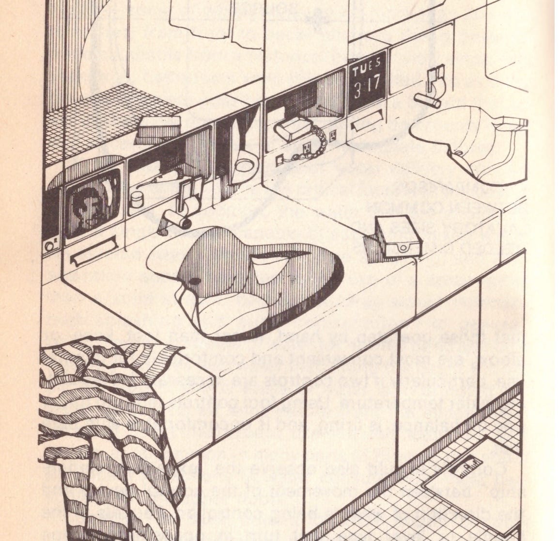
However, Alexander Kira might have some trouble with it; he noted that “inadequate storage space in the bathroom has long been a major shortcoming.” He calls for at least a square foot of flat surface, and notes that with the increasing prevalence of electric toothbrushes and water-piks, (writing this in 1966!) There needs to be wiring and storage built in right behind the sink. The TV is a nice touch, too.
It shouldn’t be so hard; put the vanity height at 36”. Pick a sink that is easy to clean. Pick a faucet with lots of room between it and the sink. Make it big enough to catch everything. Put lots of storage right behind it. But good luck trying to find all this.
It makes me crazy; we have so many visions of the future of the bathroom, and they always have wonderful electronic screens built into the mirrors to tell you about your health, and then the sink is at knee height, and the toothbrush is on the counter. But nobody ever thinks about how a sink should actually work. It’s time we did.






Even if I ignored your entire post about utility and hygiene that Infection Control Sink is the loveliest sink I have seen with those delightful curves!
In my experience, the worst holdover from the "sink as basin" era are the egregiously short faucet spouts that make it almost impossible to wash one's hands without smushing them against the back end of the sink. I'm not sure what the use case for such short spouts are today, since they're too short for even the smallest sinks.
On a more positive note, it seems like the easiest way to get the most "functional" sink would be to install a faucet over an urinal!