Austin Maynard's ParkLife represents a different way of doing housing
It's not just the building design; it is the development model which puts the architects in charge.
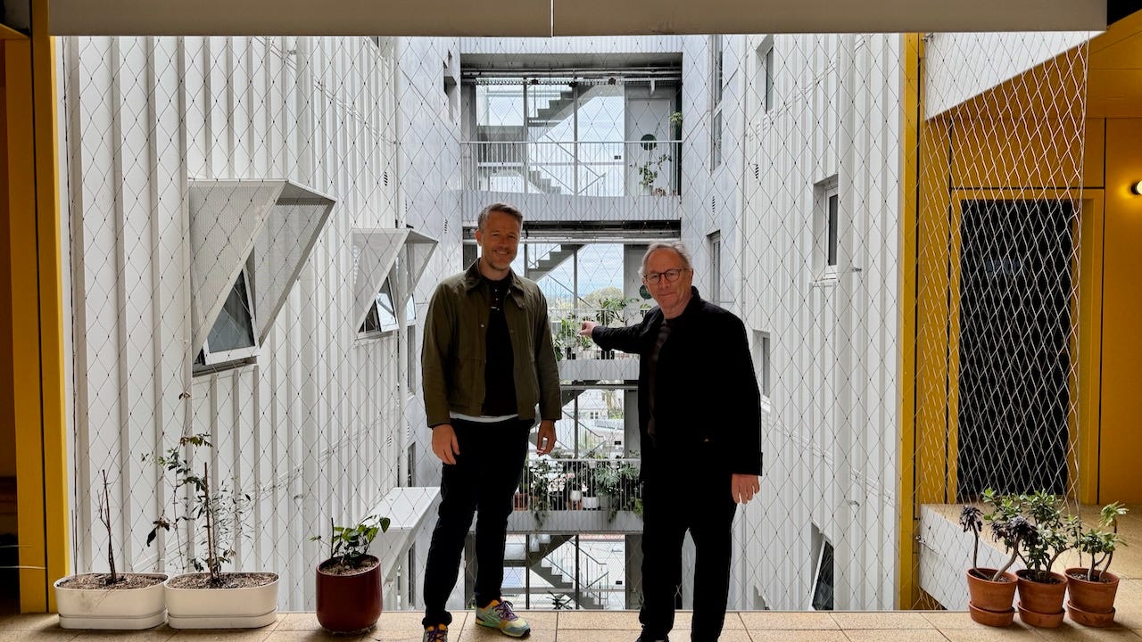
One of the reasons I was so excited about going to Melbourne was that I would get to see the work of architect Andrew Maynard of Austin Maynard, who I have been following since 2005 when he was designing hanging prefabs and suburb-eating robots. (here is a summary of his earlier work I put into a lecture and a treehugger post) I don’t know how I discovered him, but I was smitten with his architectural sense of humour and his skills at driving a truck through conventions and regulations. We were going to meet at his ParkLife project but he recognized me walking up Brunswick Street and jumped off the tram he was riding, which I think is pretty remarkable since we had never met in person.
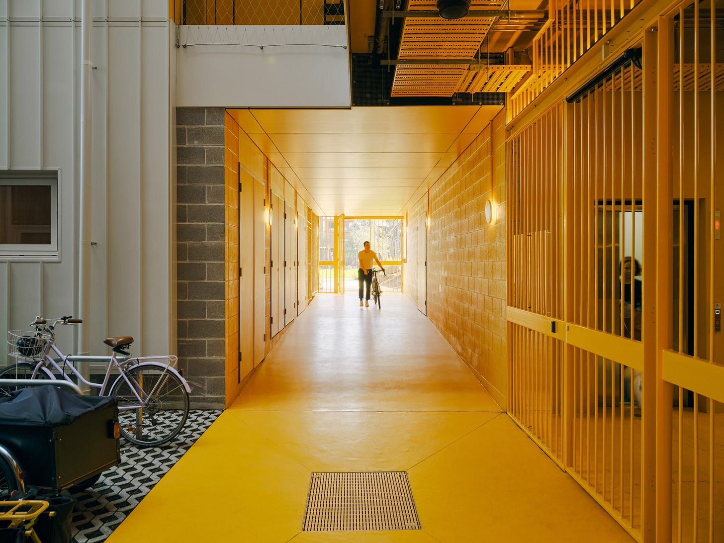
You know ParkLife is a Maynard project as soon as you walk through the gate- it is a semi-public passage from the street to the park (there are a lot of passages and lanes in Melbourne) and it is all bright yellow, because Maynard says, “it’s easier. and cheaper.” Maynard writes:
The glazed staircase is also bright yellow and, rather than a standard dimly-lit concrete tunnel, is flooded with natural light, with views and greenery, while showcasing the life within the building. To quote Vince Van Gogh: “How lovely yellow is. It stands for the sun.”
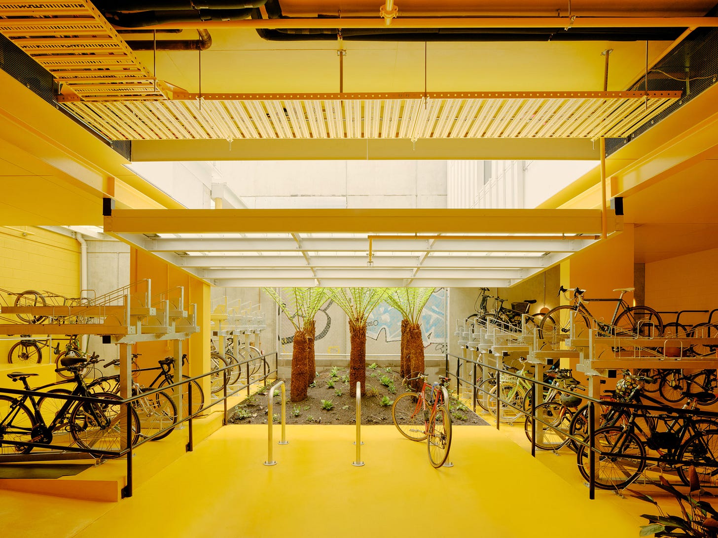
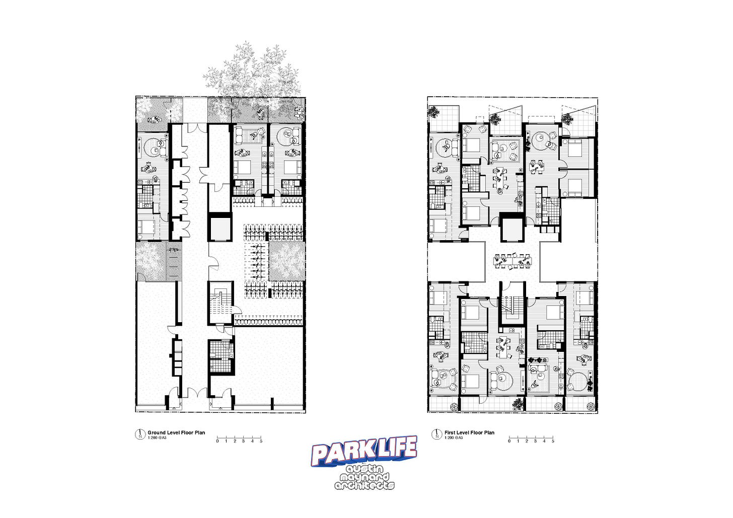
To get to the units you go through another gate, and instead of a typical lobby, you are in the bicycle storage room, which has trees and a light well above. No normal architect or developer would have you enter an apartment building through the bike locker, but that’s Andrew Maynard, setting the tone for the project. I have written many times about Austin Maynard’s practicality and humour, and they see it in the mirror, writing:
“These little moments that are logical, pragmatic and simple have become Austin Maynard Architects’ favourite parts of the building. Beautifully functional additions, rather than decorative. In the Austin Maynard way, functionality does not mean boring; moments of surprise and delight, simple and efficient, cost effective, strategic and playful. Moments of joy.”
You could take the single stair up; it is bright and inviting with glass on each end, but we took the lift.
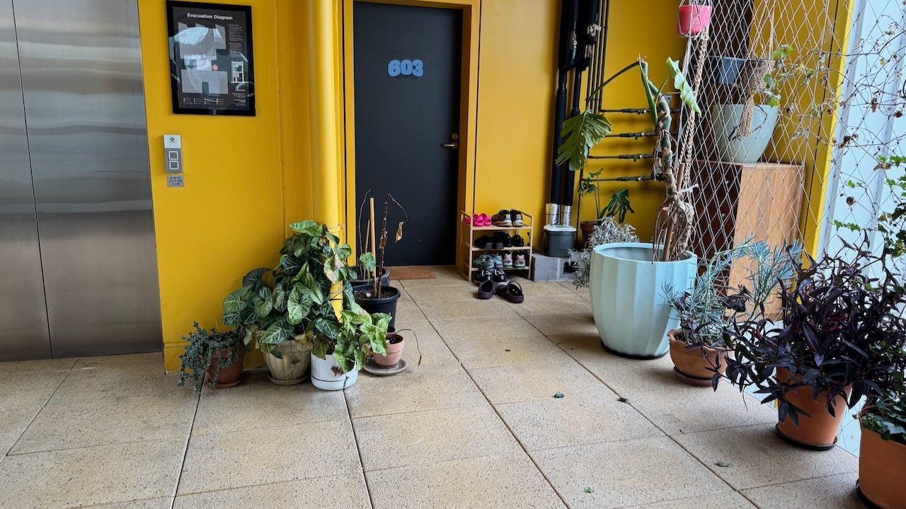
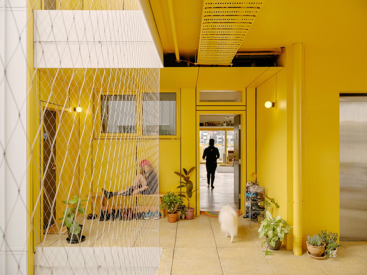
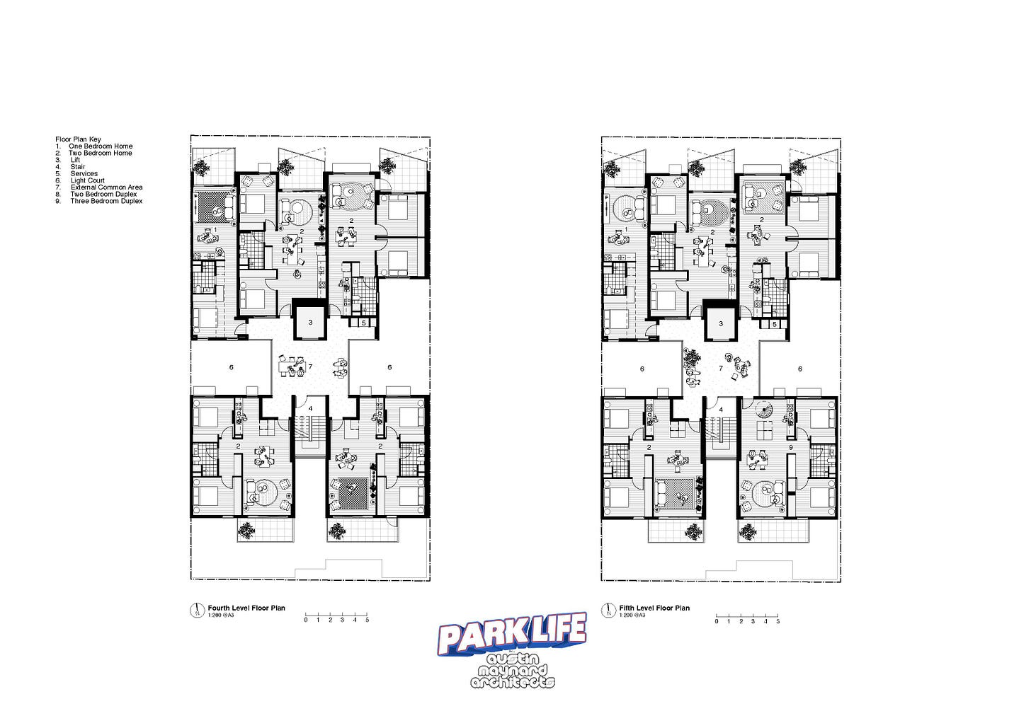
When you get off the lift you are not in a drab corridor but a big open area overlooking the light well, full of baby strollers and shoe racks and all the paraphernalia of life; Maynard says that the hardest thing about going from a house to a flat or apartment is not giving up the back yard, but the front porch or stoop where you keep all this stuff of life that you need to raise children. In fact, the landing is big enough to act as the back yard and the garage; many people bring their cargo bikes, fully laden with groceries, up the big elevator and unload it at the door.
Instead of a traditional guard or handrail overlooking the light well, there is steel netting. This scared me to death; I was holding on to it and asking is this legal? Maynard said of course it is, it is all tested, and it is safer than a conventional handrail. In the adjoining building, residents put furniture up against the handrail and kids could climb up on it, getting very close to the top of the handrail. Nobody can get through the netting.
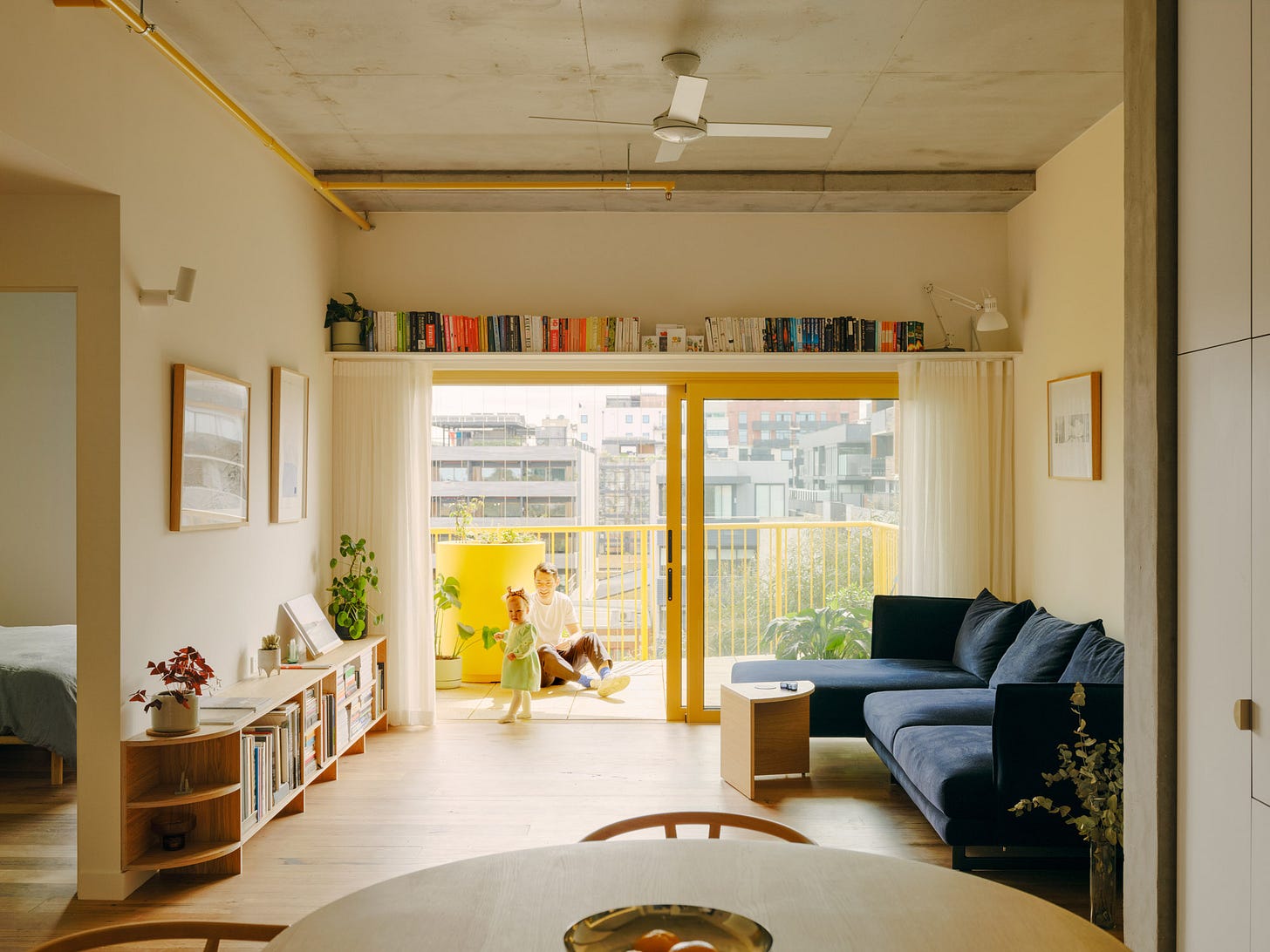
Inside, the units have exposed concrete ceilings and columns, with double-stud walls between units, which Andrew says are better acoustically than concrete. Kitchens have very generous storage, and balconies have electricity and water hookups. Appliances are all Fisher Paykel, the standard in Australia and New Zealand where they are made. From the press release:
“The interior palette of materials were kept deliberately simple; timber floors, white walls, white cabinetry, concrete ceiling and a terrazzo tile in the bathroom. The intent was to allow the community to personalise their homes rather than apply too many finishes and textures. Attractive, functional spaces were created with great views and lots of light, which can be embellished in any way the residents want to make the apartment their home.”
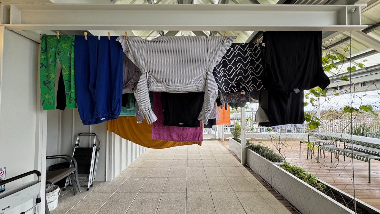
We went up the yellow stairs to the roof where there is a sort of bleacher stair because the bylaws insisted on a setback, a big laundry room with lots of F-P washing machines (little Euro sized ones because they are cheap) and a hanging area.
There are a few electric condenser dryers because Andrew says “parents with kids can’t wait for clothing to air-dry.” He is not troubled by the electricity consumption, noting that there are solar panels on the roof and New Zealand’s electricity supply is low-carbon- so much for the virtues of line drying that we used to go on about.
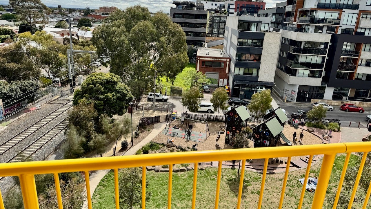
Seated in those bleacher seats, one overlooks Bulleke-Bek park which was purchased by the local council; It was full of parents and kids. The commuter train runs by the project but inside, nobody hears it or feels it, the building is on anti-vibration mounts and the windows are high quality.
The building is not Passivhaus, but has a “9 Star” rating and Passivhaus-like features: each apartment has an energy-recovery ventilator, no active heating, and mimimized thermal bridging as it is covered in insulated panels. There is no air conditioning, but “misters are installed within the light wells that mist out harvested water during the hotter days so that windows from the bedrooms can be opened up to draw in the cool air through cross ventilation.”
There are many reasons that developments like this don’t happen in North America. The building code allows for single stairs, which eliminates the need for long corridors; every unit can open into the large landing between the elevator and the fire-separated stairs.
It also makes smaller, narrower buildings economically viable. The climate is moderate so people are comfortable with outdoor access. There is no parking for cars, which significantly reduces cost and time.
But the most remarkable difference is the development model. Andrew Maynard explains:
“Mark Austin and I (Austin Maynard Architects) were both the developer and the architects of ParkLife. We secured our site, secured our own investors and funding. We did this as part of a collection of 6 architecture firms. The six building/developments in the village are…
- ParkLife designed and developed by Austin Maynard Architects.
- Evergreen designed and developed by Clare Cousins Architects.
- Leftfield designed and developed by Kennedy Nolan.
- CRT+YRD designed and developed by Hayball.
- Skye House designed and developed by Breathe.
- Urban Coup designed by Architecture Architecture and developed by the Urban Coup cooperative.
Each architect undertook the same developer/architect model with the central aim to create triple bottom line housing that is financially, environmentally and socially sustainable. Hence, architects working as collaborators, rather than competitors.”
In these projects, the architects are in control, and it shows. There is a lot of conventional development in Melbourne, with conventional garages and fancy finishes. But there is room for something different, room for firms like Austin Maynard to change the way we design housing. Architects and developers everywhere should pay attention.
UPDATE: totally coincidentally, another Toronto writer, Brian Sholis, interviewed a resident in the building and published on the same day. The Frontier Interview: Kai B., a resident of Melbourne’s Nightingale Village





I love the idea of the large yellow landing spaces for storage outside of each unit, and ESPECIALLY love the communal bleacher seating area to enjoy the outdoors! My thoughts on why this doesn't happen more often in North America is because almost all multi-family housing is investor-owned and they seek to maximize profitability by building low upfront cost designs. A project like this would command a premium, but not enough so to offset what the investor class sees as an unnecessary buy-in.
In other words, the elite will give the serfs just enough to keep them from revolting.
I’m much less fond of heights these days but I’ve found that it can be greatly alleviated by having my hand firmly holding on to a railing. I’ve no doubt that the mesh is secure but psychologically the lack of that handrail would limit my ability to enjoy the openness. Otherwise, a great looking project!